Every few weeks somebody sends us a link and a question that amounts to the same thing: the site feels fast to me, so why do people say it is slow?
They are both right. You are testing on a desktop machine, on office fibre, with every file already cached from the last twenty times you opened it, probably a few hundred kilometres from the server. Your customer is on a three-year-old Android, on a shared 4G cell, with an empty cache, opening your link for the first time from inside Instagram's in-app browser. Those are not the same website. They are barely the same internet.
This is a note on where that gap actually comes from, what to check, and what is usually worth fixing. It is not a rebuild pitch — most sites we look at do not need one.
What Google actually measures
Three numbers, and it is worth knowing them because they are the vocabulary everyone else uses:
- LCP — Largest Contentful Paint. How long until the biggest thing on screen, usually your hero image or headline, has actually rendered. Good is under 2.5 seconds.
- INP — Interaction to Next Paint. When someone taps, how long before the page visibly responds. Good is under 200 milliseconds. It replaced the older First Input Delay in 2024 because FID only measured the first tap, which flattered almost everybody.
- CLS — Cumulative Layout Shift. How much the page moves around while it loads. Good is under 0.1. This is the one people ignore, and it is the one customers feel most, because it is why they tap the wrong thing.
Those thresholds are Google's, not ours. They are also assessed on real visits, not on your test — which is the first place the office impression and the reported reality come apart.
The four things it usually is
In rough order of how often we find them:
1. Images sized for a desktop, shipped to a phone
A hero photograph exported at 2,400 pixels wide and 1.8 MB, delivered untouched to a 390-pixel screen. The phone downloads all of it over the mobile network, decodes all of it, then throws away 84 per cent of the pixels. Nothing else on the page can start until it is done, because it is usually the LCP element too.
The fix is unglamorous and it works every time: serve modern formats (WebP or AVIF), serve several sizes and let the browser choose, set explicit width and height so the space is reserved before the file arrives, and lazy-load anything below the fold. If your site is on a framework with an image component, this is largely a matter of using it. If it is on WordPress, a decent image plugin does most of it.
2. Third-party scripts you forgot you installed
The chat widget, the analytics tag, the ad pixel, the heatmap recorder, the cookie banner, the review widget, the A/B testing tool that was for one experiment in 2024. Each one is a separate DNS lookup, a separate connection, a separate file, and — the expensive part — separate JavaScript executing on the same single thread your page needs to respond to taps. This is where INP goes to die.
Open your site with the network panel recording and sort by domain. Count the domains that are not yours. Then ask, honestly, which of those tools anybody in your company has opened in the last three months. The ones nobody has are pure cost.
3. Fonts that block or shift the text
A custom typeface has to be downloaded before it can be drawn. Depending on how it is loaded, the browser either shows nothing until it arrives (invisible text, terrible LCP) or shows a fallback and then swaps (visible text, but every line jumps when the real font lands, which is layout shift).
Preload the one or two faces that appear above the fold, use font-display: swap, subset to the characters you actually use, and — this matters more than people expect — pick a fallback stack with similar metrics so the swap barely moves anything. Also: check you are not still loading four weights when the design uses two.
4. Layout shift, which is not really speed at all
A page can score well on every timing metric and still feel broken, because things keep moving. An ad slot with no reserved height. An image with no dimensions. A cookie bar that pushes the page down half a second after you started reading. A font swap. A section whose height is set by JavaScript after hydration.
The pattern is always the same: something arrives late and takes up space that was not reserved for it. The fix is always the same too: reserve the space up front, in CSS, before the late thing arrives.
What we found on our own site
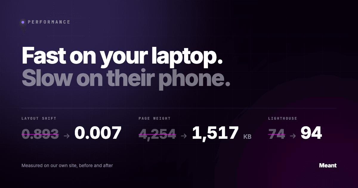
We ran this exact audit on meant.space in September 2026, which is a harsher case than most: the homepage runs a live WebGL scene, so it starts from a worse position than an ordinary marketing site. The numbers moved like this:
| Before | After | |
|---|---|---|
| Layout shift (desktop) | 0.893 | 0.007 |
| Page weight (desktop) | 4,254 KB | 1,517 KB |
| Page weight (mobile) | 1,563 KB | 1,131 KB |
| Lighthouse performance (desktop) | 74 | 94 |
| Accessibility | 96 | 100 |
Three of those wins are worth describing, because they are the kind of thing an agency invoice never mentions.
A 0.893 layout shift caused by a stylesheet. Two sections on the homepage get their height from CSS. The stylesheet is 95 KB and was applying about 600 milliseconds in, so for the first half-second the page had one shape and then it had another. We had assumed the cause was lazy-loaded components, changed those first, measured again, and found it had made no difference at all. The actual fix was four lines of critical CSS inlined in the document head, stating those two heights before anything else loads. Guessing cost us a deploy; measuring cost us ten minutes.
A 380 KB file that no phone could ever use. The 3D scene loads an HDR environment map for its lighting. On mobile the scene renders a simplified version that never references it. Every phone visit was downloading 380 KB of a file that could not affect a single pixel. One conditional removed it.
And the one that had nothing to do with speed. A line in our own robots.txt had been disallowing /_next/ since May — the directory holding every stylesheet, script and image the site serves. Google was allowed to read the HTML and forbidden from loading anything that makes it look like a website, so for three months it had been rendering our homepage as unstyled text. No score, no report and no dashboard showed this. It only turned up because we asked Google directly what it saw.
That last one is the real lesson. Performance work finds things that are not performance problems, because it is the only time anybody looks at the site the way a machine does.
The ten-minute check
You do not need us to do this part.
- Run PageSpeed Insights on your busiest page. Ignore the score for a moment and look at the top panel, the one labelled real users. That is field data from actual visits over the last month. If it is missing, your site does not get enough traffic to report, and the lab result below is all you have.
- Compare mobile to desktop. A large gap is normal. A very large gap tells you the mobile experience was never tested by anybody who works there.
- Open the page in Chrome, private window, network throttled to Slow 4G, CPU throttled 4×. Watch it load. Most problems announce themselves in the first three seconds, and you will see the shift rather than reading about it.
- Sort the network panel by size. Find the biggest three files. If any of them is an image, you have your first afternoon of work.
- Sort by domain. Count the third parties. Remove the ones nobody uses.
One caveat that saves a lot of confusion: the lab score moves every time you run it, sometimes by fifteen points, because it depends on what your machine and the network were doing that second. Run it three times and take the middle. Judge trends, not single numbers.
Fix it, or rebuild it?
Honestly: most sites should be fixed, not rebuilt. Images, scripts, fonts and reserved space will get a typical template site from a poor score to a good one in a week or two, and it costs a fraction of a rebuild.
A rebuild earns its keep when the platform itself is the ceiling — when the page has to load six plugins to render one section, when every design change needs a developer, or when the storefront is fighting the theme rather than using it. That is a different decision, and we wrote about where that line falls in the case for and against a headless rebuild.
If you want a second opinion on which of the two you are looking at, that is what our free thirty-minute call is for. You get the same audit and the same written notes whether or not we end up working together. We also build on Next.js and headless Shopify if it turns out to be the rebuild, and run technical SEO as part of every build rather than as an upsell.
But start with the ten-minute check. It is free, it takes ten minutes, and it is usually images.