
Our own site · Brand & Web · Dubai
Meant
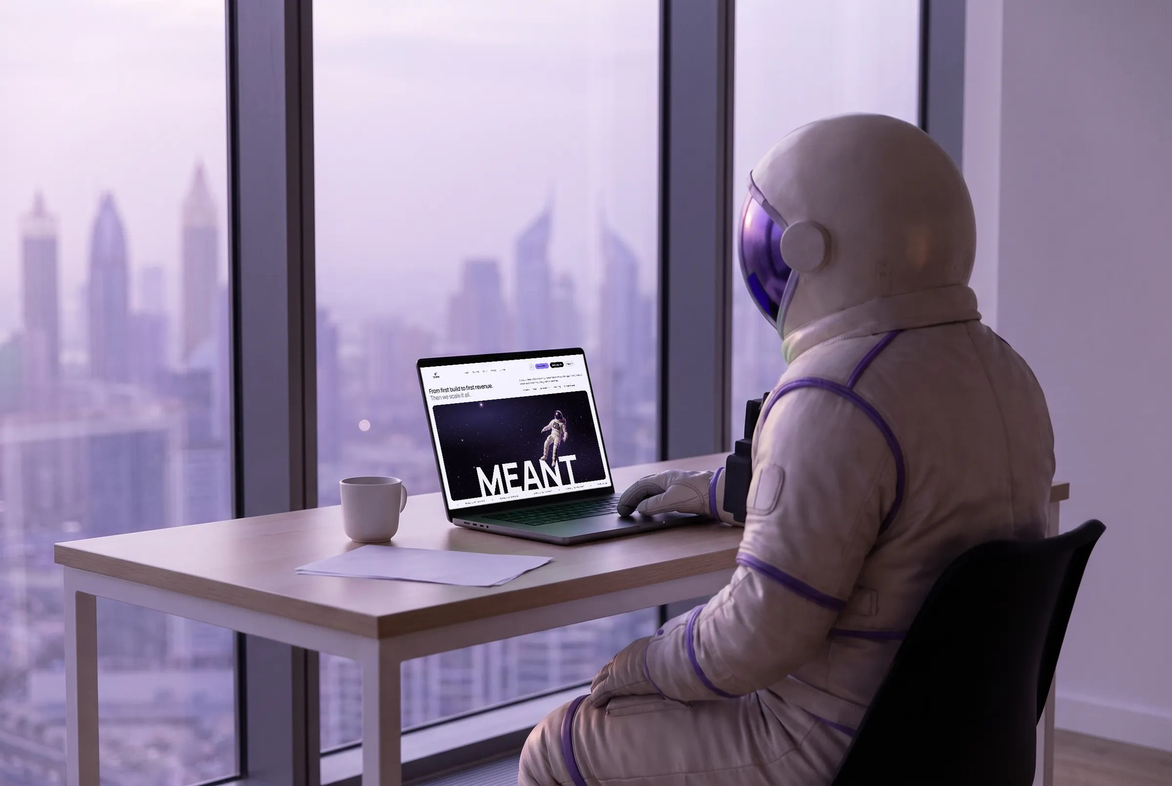
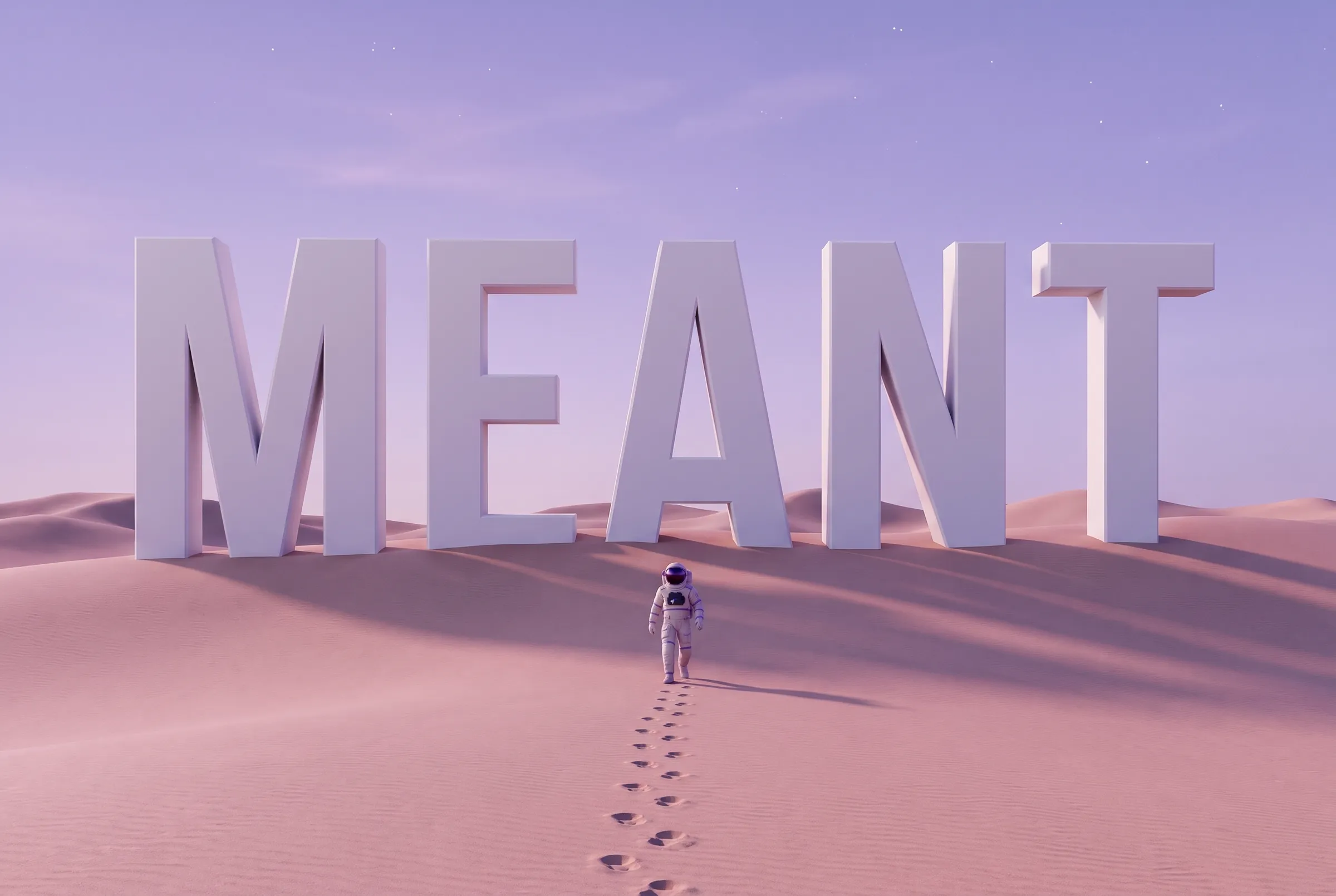
Our own website, rebuilt light: one violet, one giant word and one moment of motion per page.
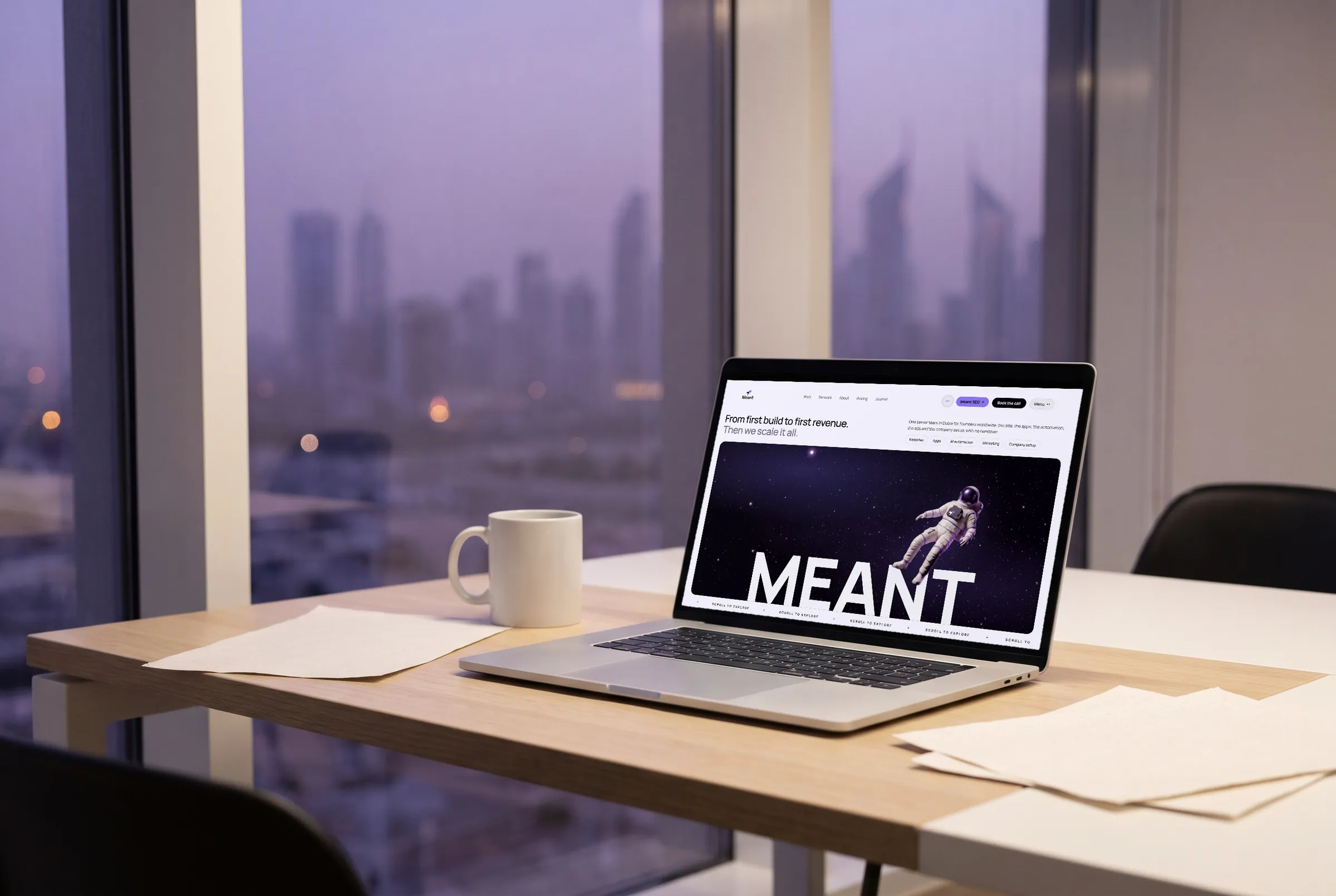
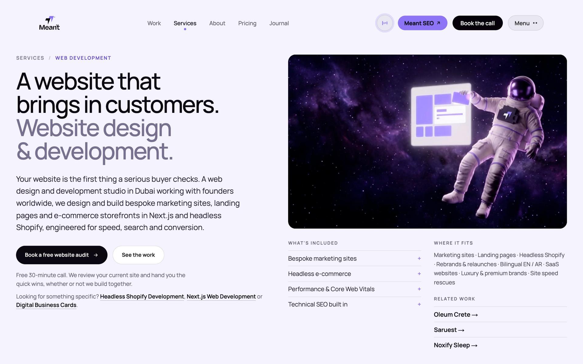
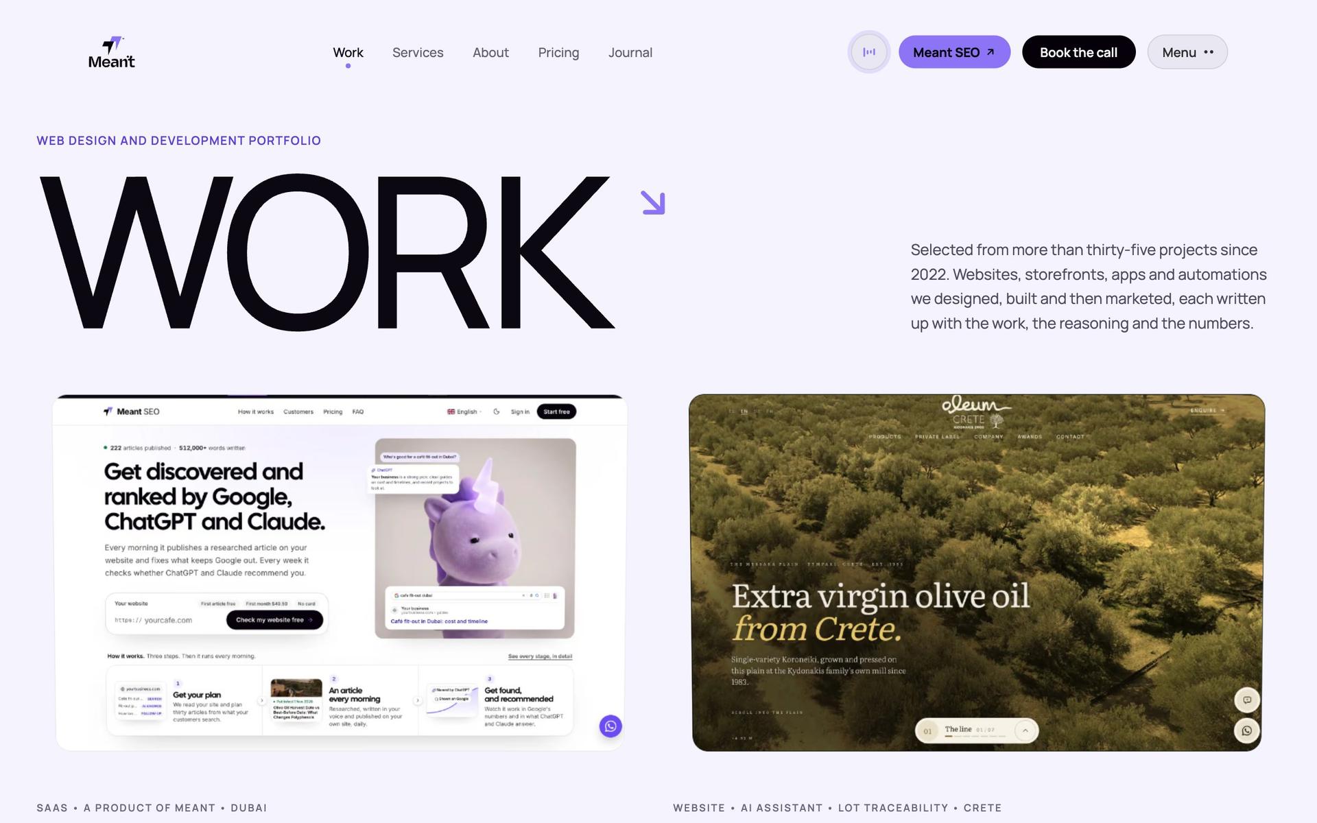
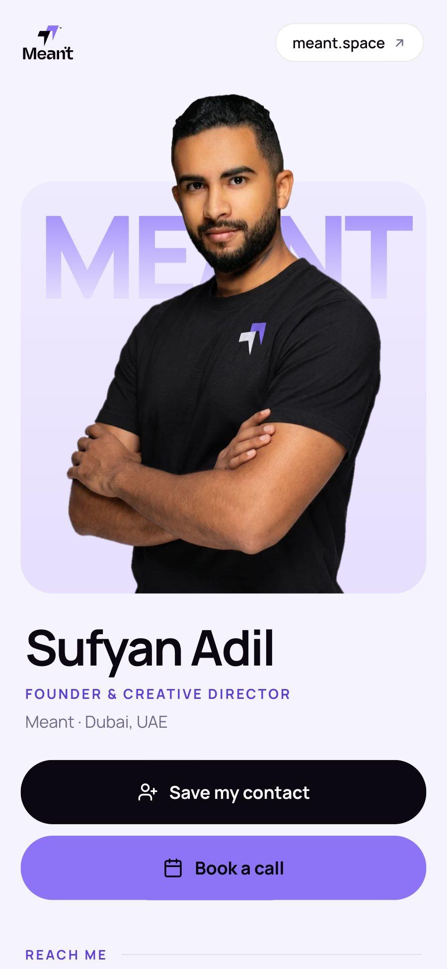
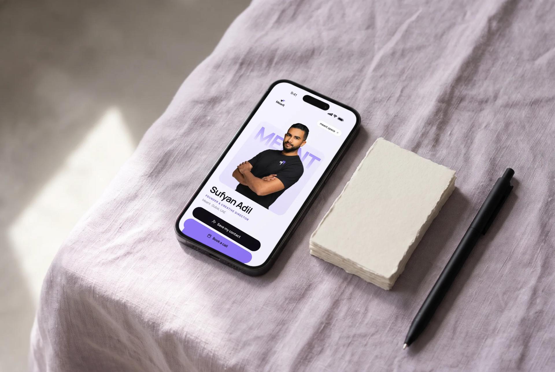
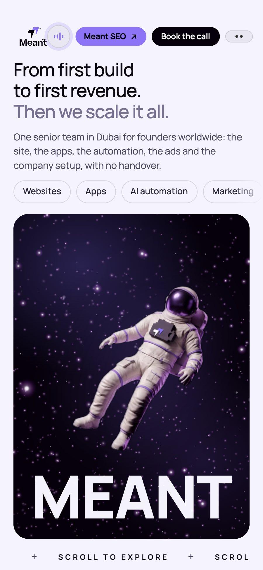
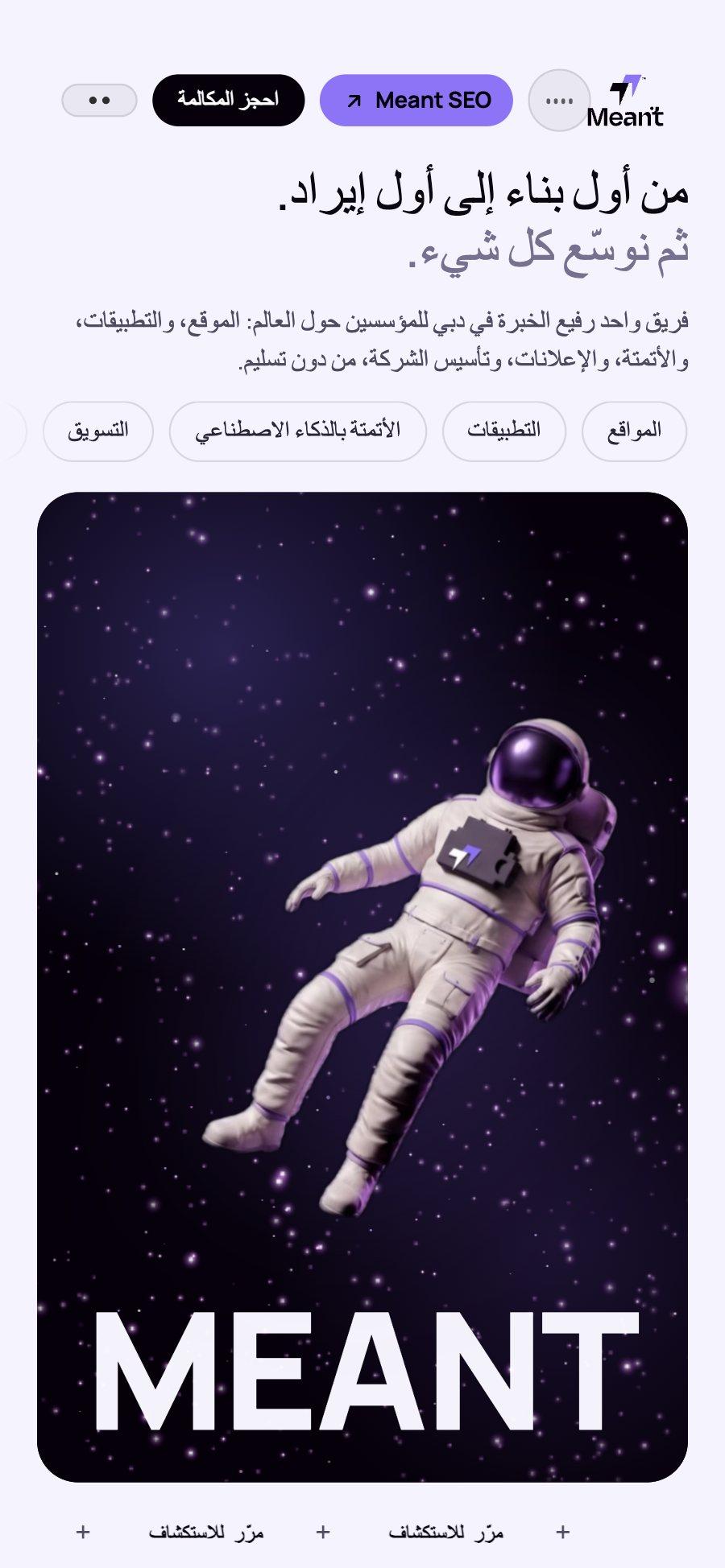
meant.space is the studio’s own website, designed and built by Meant in Dubai. In October 2026 we rebuilt it from a dark site into a light one: lilac paper, near-black ink, the one violet of the logo, Manrope for type, and a giant MEANT that carries the brand from the first screen to the last. The logo was modelled in 3D from its own vector, each page keeps to one moment of motion, the pages a first visitor sees also read in Arabic and Greek, and the same identity runs on into the email signatures, the digital business cards and the invoices.
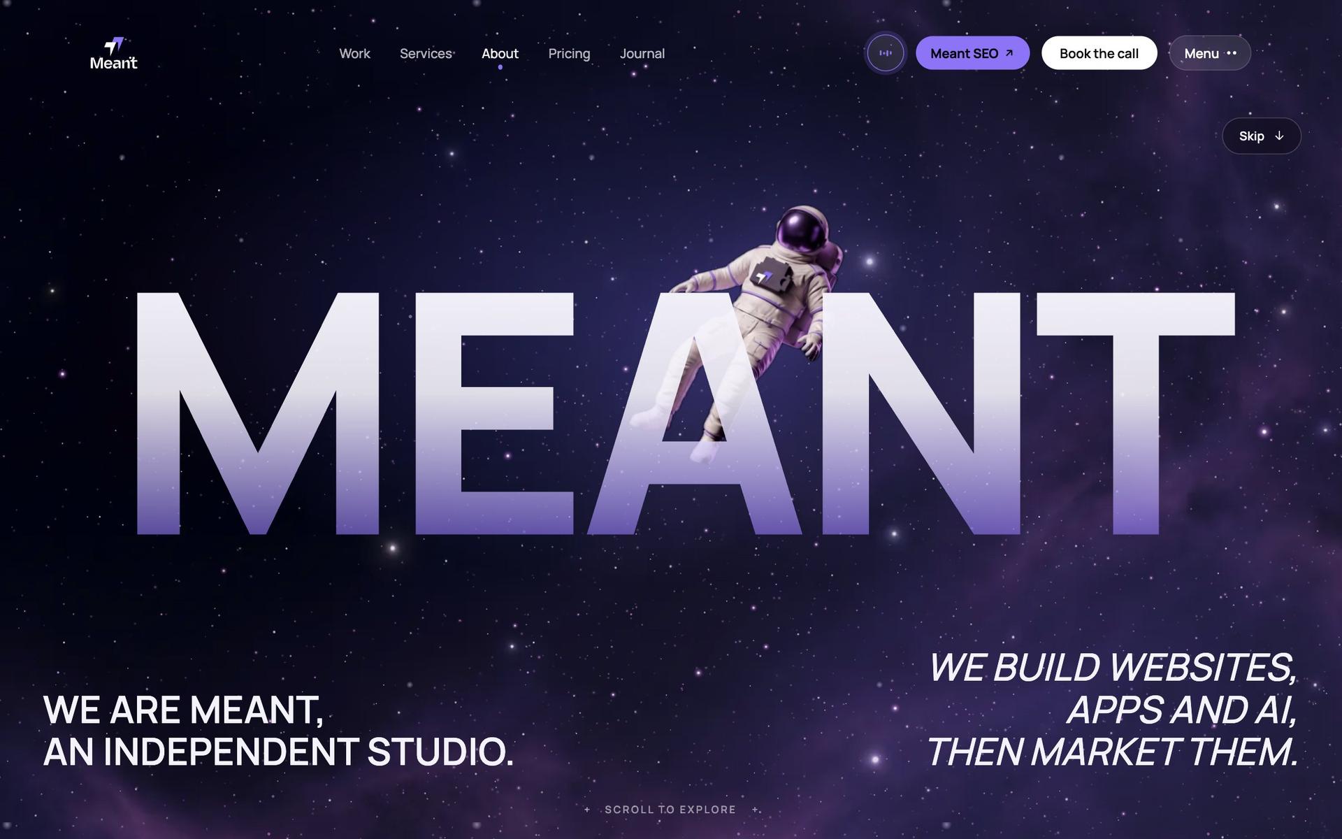
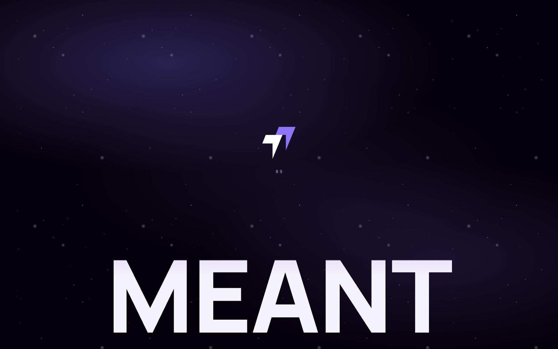
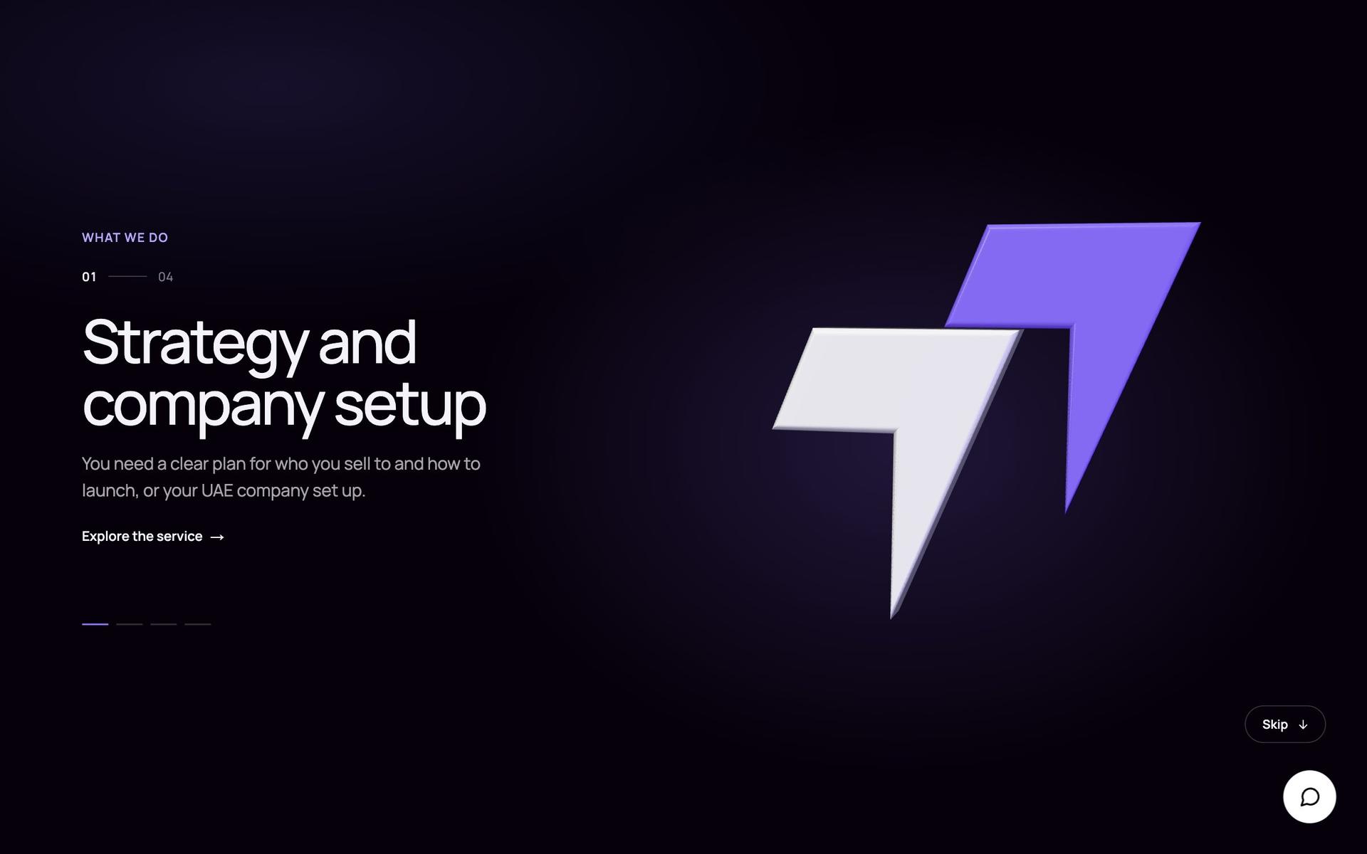
The old meant.space was dark: a starfield, a glowing particle cloud and a great deal of motion. It looked like a technology studio, but not like the founders who hire one, and the more it moved, the less anyone read. So we rebuilt it light. Lilac paper, near-black ink and one violet, #8D73F6, the exact colour of the logo, with Manrope for type and a giant MEANT as the brand’s one big gesture. The dark stayed, as a stage: the hero, the work and the services open on it, and every case study takes on its client’s own colours.
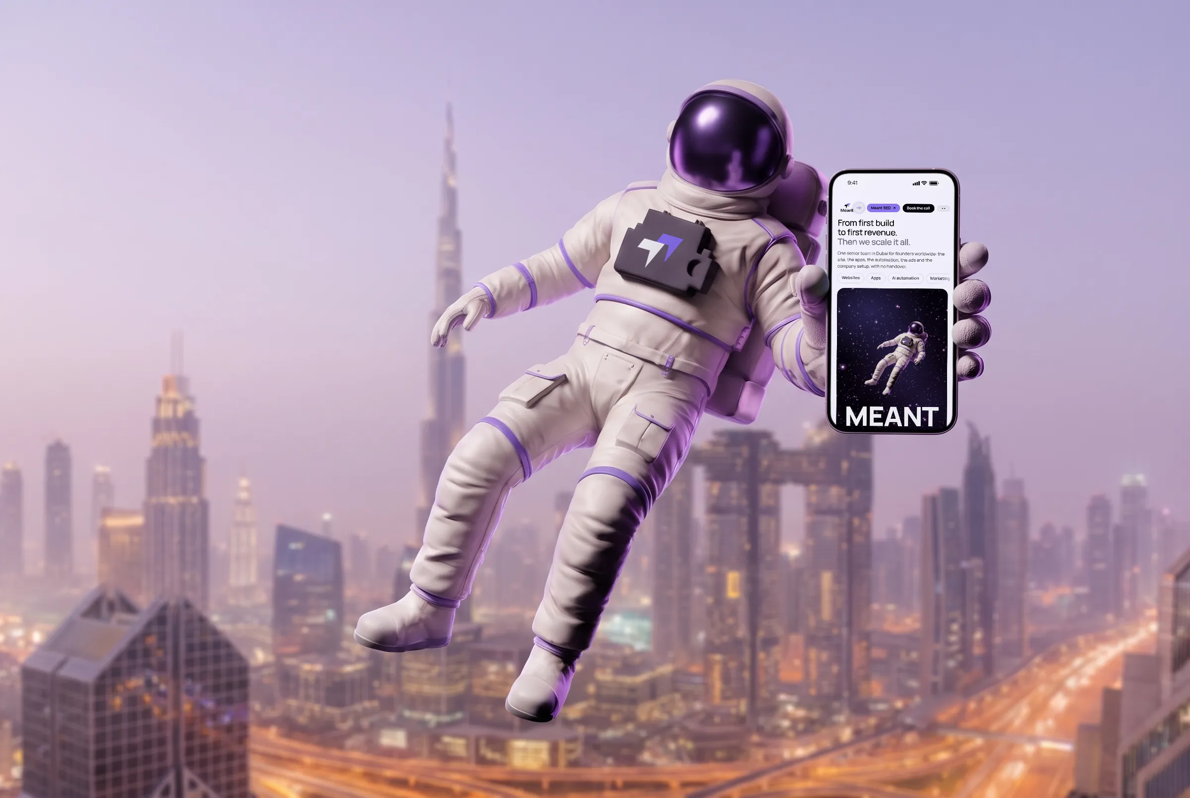
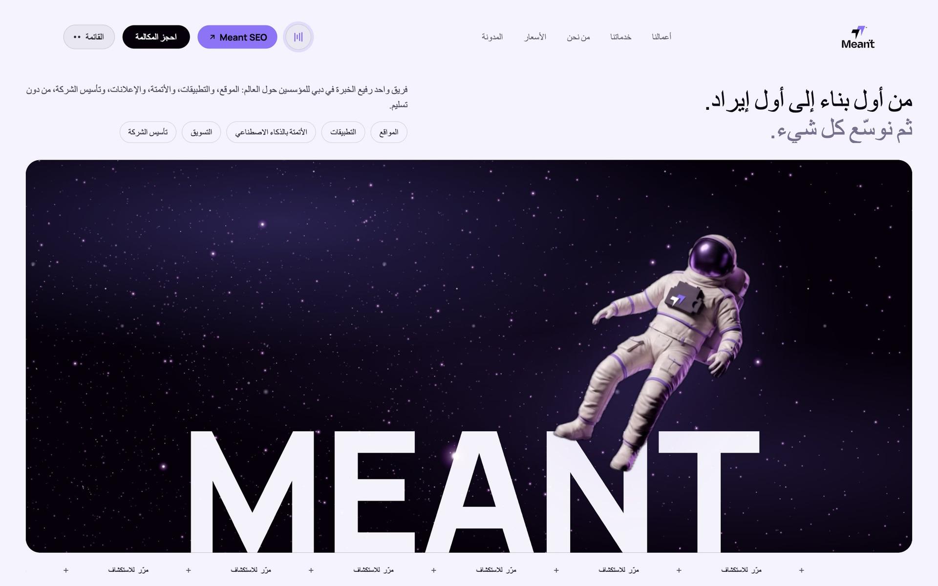
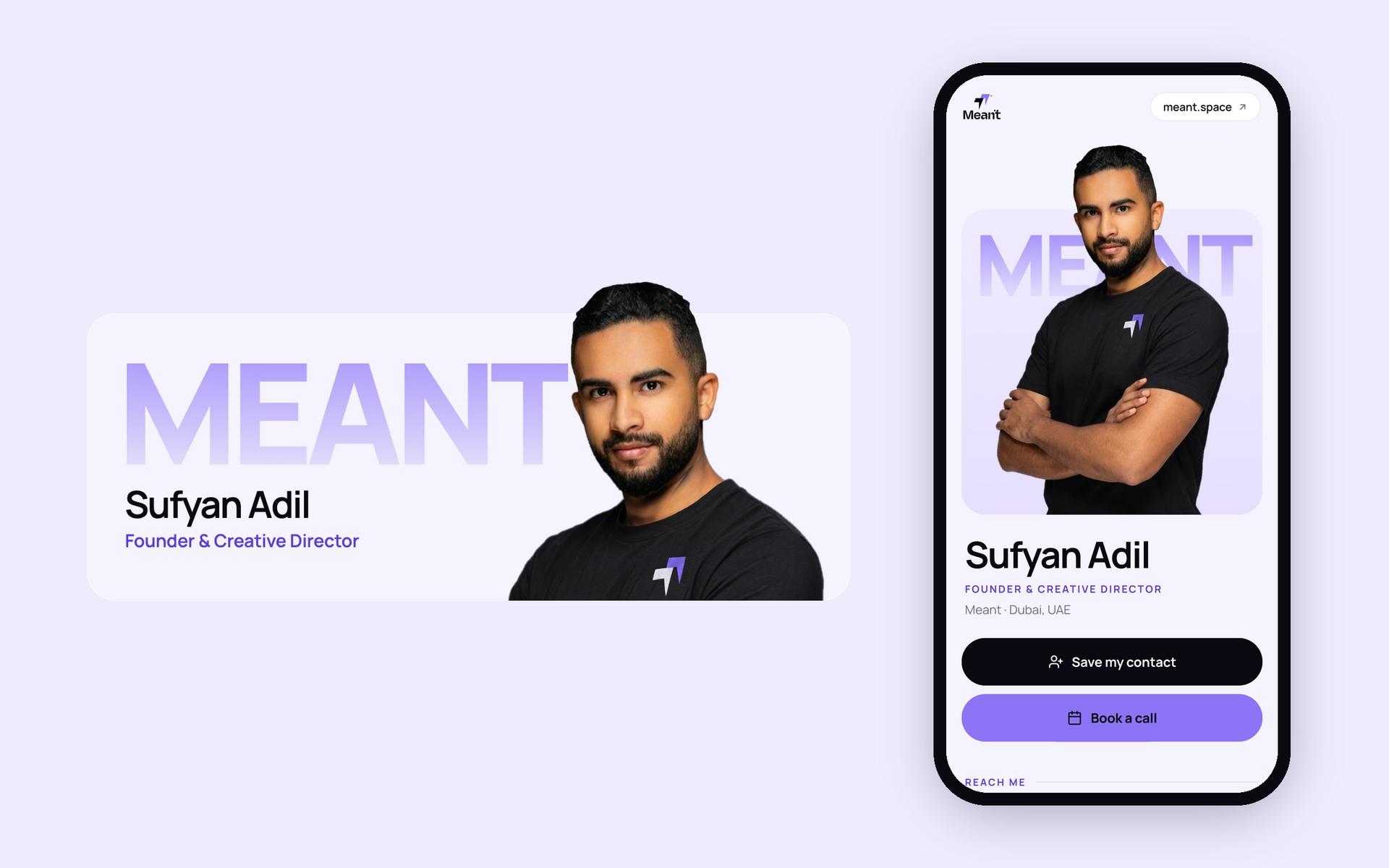
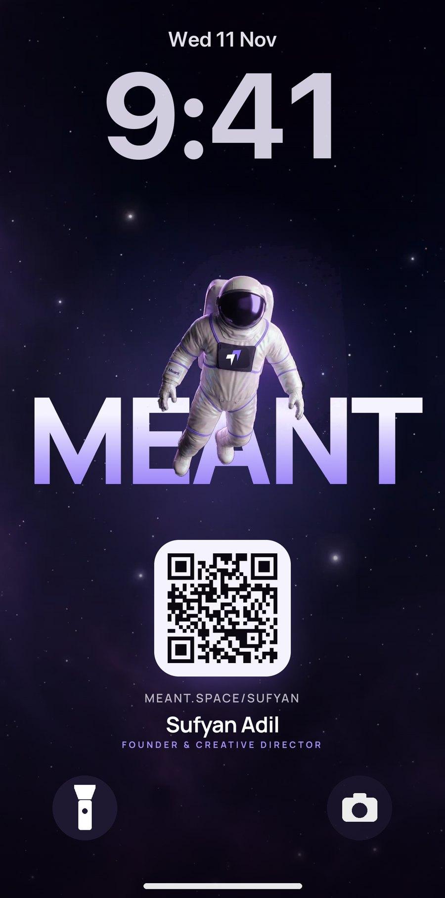
Restraint was the rule: one moment of motion per page, and everything else still. A loader that waits until the page is really ready and then lets the word rise; a page change where the header holds and only the word turns; an astronaut you can catch and throw. Visitors who ask their phone for less motion get a gentler version of the same site, not a broken one. The logo is not drawn in 3D, it is the logo, extruded from its own vector paths, so it is exact from every angle. The pages a first visitor sees read in Arabic and Greek too, the Arabic laid out right to left, and the same identity carries on into the email signatures, the digital business cards, the founder’s lock screen and the invoices we send.