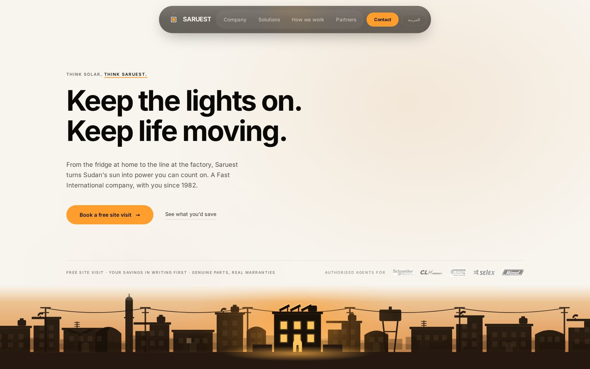
Saruest is a Sudan-based solar and energy company with a lineage that goes back to 1982: Fast International, the family trading house that has been importing, clearing and delivering across Sudan for four decades. In 2015 the same family went into energy; in 2021 it opened a division for utility-scale power projects up to 400 MW. Authorised agents for Schneider Electric Solar, Selex, Himel, CLN Energy and Powernsun.
None of that was online. A company that could keep a hospital running had a web presence that could not keep a visitor for thirty seconds. The brief was to build the brand and the site together, in English and Arabic, for a customer base that runs from a Khartoum household to a Dubai procurement office.
The brand: a solar map from above
The Irradiance Peak mark is four off-centre contour rings that read like a solar map from above, the kind of chart an energy engineer recognises and a homeowner simply finds warm. It carries a brand system built for two scripts from the start, so the Arabic and English identities are one identity rather than a translation.
The site: Arabic as a first-class layout
A bilingual Next.js site where Arabic is a layout of its own, not a mirrored afterthought: typography, spacing, navigation and imagery composed for right-to-left reading, with copy written in English and Sudanese Arabic rather than machine-translated. The two versions say the same thing to two different readers, which is harder and more valuable than it sounds.
A savings calculator that speaks the customer's language
Solar sells on a number. The calculator asks the customer whether they are a home or a business, takes the few inputs they actually know, and shows what a Saruest system would save them, in their language, before anyone has to fill in a form.
Real geography, real people
A hand-drawn footprint map sits on real geography, showing where Saruest has delivered. Every placeholder photograph was replaced with real Saruest photography, commissioned for the launch. There is a message from the Chairman, and a named team reachable in Dubai and Khartoum, because in this market a company is the people you can call.
What changed
Saruest went from invisible to specific: a brand with a mark, a site that speaks to both of its markets in their own language, a calculator that turns interest into a conversation, and the credibility of forty years of history finally written down. The partner logos, the utility-scale division and the family lineage are now the first things a procurement officer sees, not facts a salesperson has to explain.
The stack
- Logo and brand system for two scripts
- Bilingual Next.js site, English and Arabic, true right-to-left
- Savings calculator for homes and businesses
- Copy in English and Sudanese Arabic
- Photography and launch
See the work at the Saruest case study, or read about how we design and build bilingual websites and how a brand and a go-to-market plan get built together.